Have you ever seen a logo and couldn’t identify its typeface? There are a couple of sites that let you search typefaces by foundry, designer or name. A few of them even let you upload a sample of your type and then it gives you results within seconds.
But if you don’t want to do that and identify the font yourself, then here are a couple of tips that could help you.
HELVETICA
The letters to look out for are
- upper case R which is pretty distinguishable from the other R's.

Akzidenz-Grotesk and Helvetica are very similar since Helvetica was designed on the basis of Akzidens-Grotesk. A few letters like c, e, g, j, t, y of Helvetica have straight cut edges. For example:


Letters like d, g, p, q in Helvetica are more rounded.

FUTURA
Futura has a very unusual and a beautiful ‘A’.

Other distinguishable letter is the j, it is completely straight at the bottom.

GILL SANS
Has a distinct lower case g and t.

ITC AVANT GARDE GOTHIC
Has a very sleek upper case Q and an R.

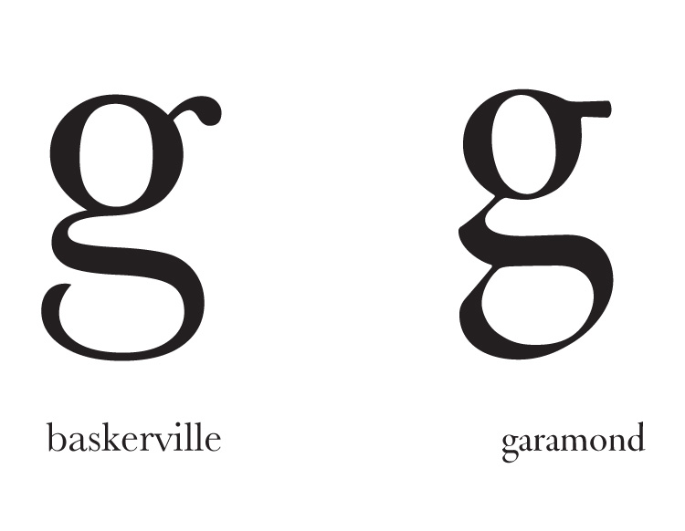
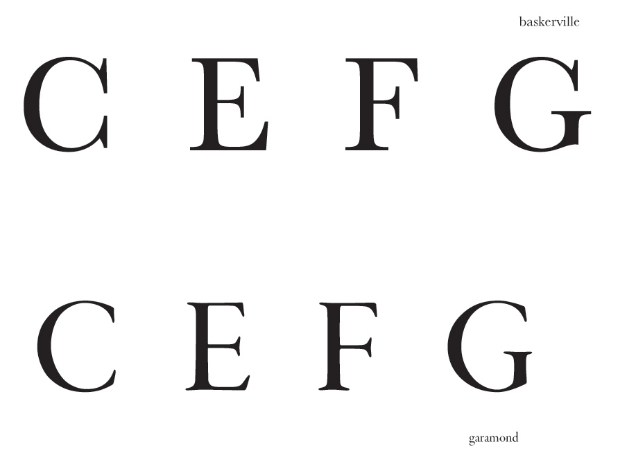
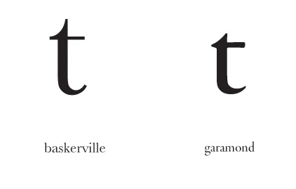
BASKERVILLE & GARAMOND
The counter in the lower case g in Baskerville is open while the one in Garamond is closed.

The serifs of upper case letters like c,e,f,g in Baskerville are a little different from the ones in Garamond.
The upper case A in Garamond has a twitch at the top.

The lower case t of Garamond has an almost straight notch at the top while the one on Baskerville is pretty different .
BODONI & DIDOT
Didot 'a' looks like a sagging tummy.

The terminals of Bodoni are perfectly straight, whereas the ones in didot are slightly curved. For example d,h, k, l etc

Lower case t of Didot at the top is very much curved as compared to that of Bodoni.

Upper case w are very different from each other.

Q also different.

So, that's about it.


